PocketFi
WEB3 / CRYPTO
FINTECH
MOBILE APP DESIGN
UI/UX DESIGN
Most Web3 products are built for people already fluent in the space. I wanted to challenge myself to use the same technology for the everyday user, to see if I could hide everything that makes it intimidating . To me, good design is invisible, fitting into the user experience so seamlessly that it removes all friction. With PocketFi, success meant a family could use it and never know it was Web3 underneath.
UI / UX DESIGNER
SEPT 2025 · TWO-DAY SPRINT
SOLO PROJECT
POCKETFI-APP.JPG

001 THE INSPIRATION
I wanted to use Web3 for something Web3 was never meant for
Most Web3 products are built for people who already speak the language. I wanted to challenge this and use Web3 technology for managing money, but for the everyday person. As a college student, I am always struggling to manage my money. So, I thought what better than to design for myself, and those close to me.
HOW MIGHT WE
How might we give a family the transparency and control Web3 promises, without making them learn what Web3 even is?
002 THE SOLUTION
Meet Account Abstraction (ERC 4337)
Parents and teens do not have to buy crypto or think about what the chain is. ERC-4337 handles all of that in the background.
Parents and teens never have to buy crypto or think about transaction costs.
How: a Paymaster quietly pays network fees on the family's behalf, so nobody needs their own crypto to get started.
No more gas fees
Parents set a weekly allowance. If a teen tries to overspend, the wallet blocks it automatically.
How: every purchase is checked against the family's rules before it's approved, the same way a debit card checks your balance.
Real Spending Limits
If a phone is lost or a password is forgotten, nobody loses access to the family's money.
How: 2 of 3 family members (or a Face ID/Passkey) can approve a recovery — so there's no single point of failure.
Easy Recovery
003 DESIGN PROCESS
Designed for the Average Adam
I wanted this app to feel intuitive, to present web3 in such a way where it is accessible to anyone, regardless of their technical background. My goal was to make the technology feel human and inviting. I kept coming back to this app and thinking: would my mom get this?
Understanding User Flow:
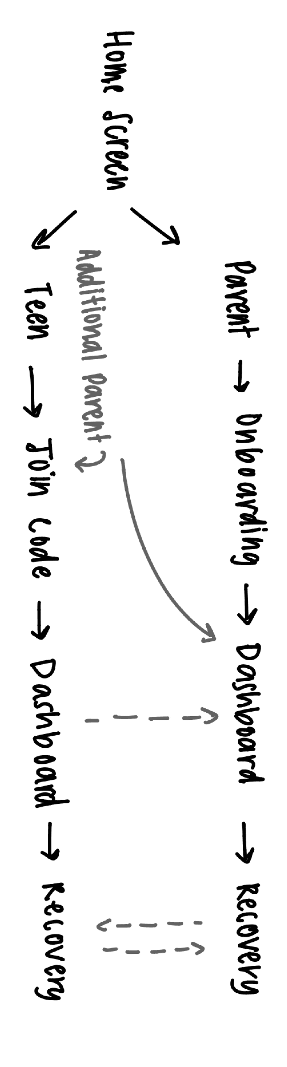
Parents and teens enter through different paths: a parent onboards and sets up the family, while a teen joins with a simple code. However, both paths lead to the same shared dashboard and the same seedless recovery, no matter who’s using the app
Design Elements:
Be Vietnam Font
Be Vietnam Font

004 BREAKDOWN
Onboarding
Parents and teens each get their own unique login. A parent sets up the household and invites members, while a teen joins through a simple code, no crypto knowledge required from either side (that's the point!)

Elements
Under the Hood: ERC-4337 technology is working, but hidden making the UI intuitive
Friendly Avatars: playful character icons keep the tone approachable
Allowance Setup: onboarding ends with parents setting their teens’ weekly limit so the value is immediate
Home View


Parent View
Teen View
Teen Request Funds
Parent and teen dashboards share the same visual language but surface different priorities. Parents see the whole family’s activity at a glance, while teens see their own limit, spending, and savings goals, with a simple way to request.
Recovery
If a phone is lost or a password is forgotten, no one loses access to the family’s money — recovery works through people and biometrics families already trust, with no seed phrase to remember or lose.

Toggle to go from Low to Hi Fidelity!
Get approval from 2 out of 3 family members
Family Recovery


If biometrics aren’t an option, 2 of 3 family members can approve access , so no single forgotten password locks the family out
Use biometric authentication (fingerprint, face ID, etc.)
Passkey Recovery


Biometric authentication lets a single family member regain access instantly, the same way they would unlock their phone
005 FINAL PRODUCT
006 REFLECTION
The hardest part of this project was not the design. It was deciding what to hide. This project taught me that the real design challenge isn't the UI, but determining how to present the information at hand. I went through many iterations of this prototype before deciding on something that I would never have expected a Web3 app to look like: bright colors, animated icons, rounded corners. Each choice was intentional and each helped me challenge my biases of design, especially as it relates to Web3 design. And, if PocketFi works, nobody who uses it will ever need to know what ERC-4337 stands for. That's a win for me!
Thanks for staying awhile, until next time!